First Info Visualization Project
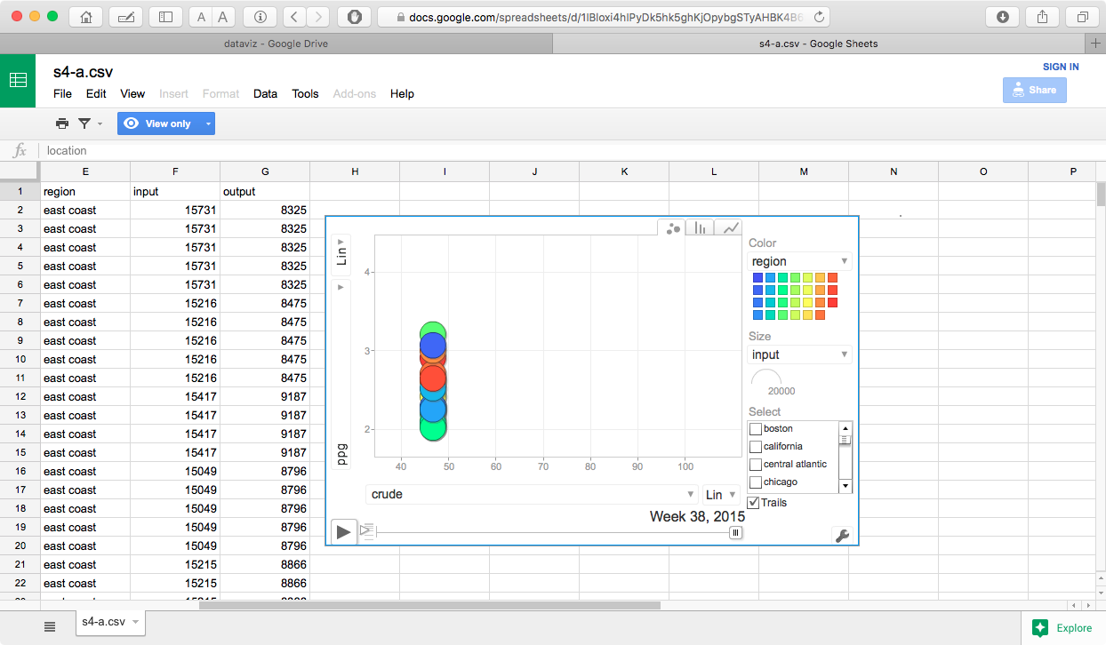
This visualization shows the change in gasoline prices with relation to crude oil prices gas production and total refinery input capacity by week for the time period between January 2014 and October 2015.
Process
Data was downloaded from the US Energy Information Administration as a set of Excel files, and converted to CSV. Once converted to CSV, I created a set of tables in MySQL so I could join the input parameters into a single row by week. Once the data was selected, I uploaded to Google drive and created the spreadsheet with the motion chart.
Problems
The data available from the EIA goes back to 1994, however the regional data is sporadic prior to 2005. I initially attempted to use the data range (Jan 2005 to present) where the regional data was complete, this caused some problems as the uploaded data file was too large to be included in a Google spreadsheet. After some experimentation, it seemed that anything larger than approximately 2M caused this error. As a result of this, I ended using the January 2014 to current date as the range.
One other issue is that this data may not best be represented as a motion scatter plot, while 2 variables (crude price/barrel, and regional fuel price/gallon) are extremely variable, the total refinery input and output levels are stagnant. This makes having a third size dimension difficult to visualize, as there is not enough variation for any significant visual distinctions. The other issue is that the crude oil price, refinery input/output levels are national figures. This also makes any differences difficult to visualize.
I think that a map chart with growing/contracting bubbles overlaid on the regions of interest may be a better visualization for this sort of data. The size of the bubbles could relate to the gas price, and crude prices could be represented by either distinct colors or saturation levels.
Results
One thing that is immediately noticeable in the visualization is that gasoline prices are very closely linked to crude oil prices, and that refinery input/output levels do not seem to have much impact here. I think the most interesting thing is that the price spread between the various regional areas not consistent. If you select a specific region to track, you will see it move up and down within the entire cluster over time, additionally the greatest variation in regional prices seems to be when the price of crude oil is towards the lower end of the price range.
link to original google sheetFirst Info Visualization Project - Revision
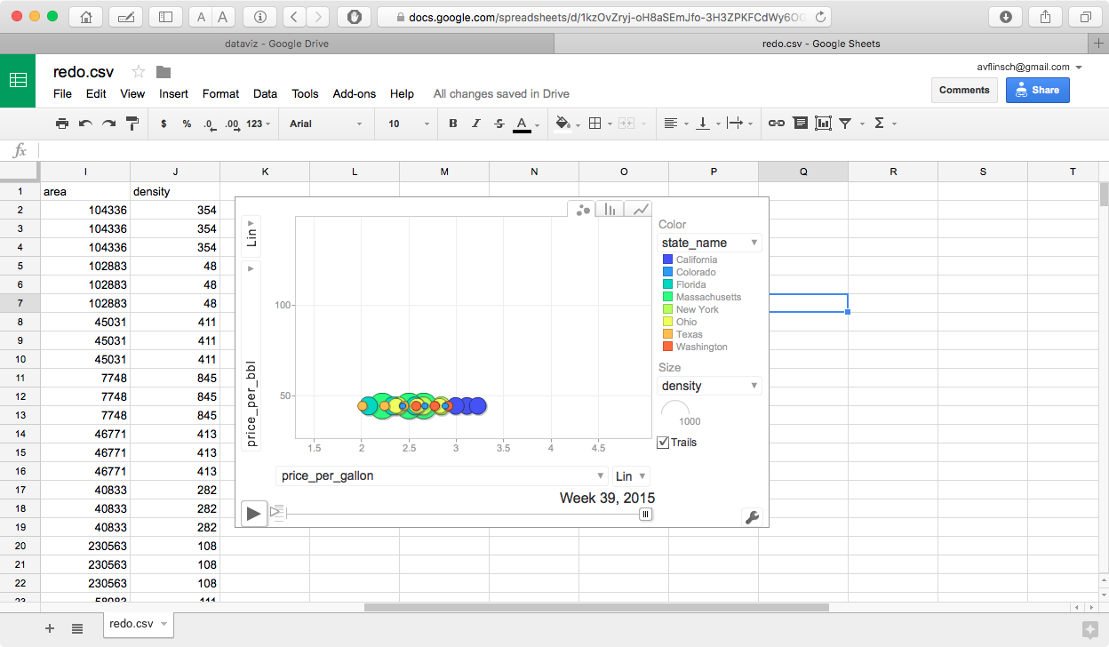
This version has some artificially created entities (State name x fuel grade). I needed to do this in order to create the required number of entities for this project. I also added size variables for state population, land area, and population density.
Color (grouping categories) have been added also, fuel grade, state-x-grade and state name.
While this visualization allows for grouping and sizing by various variables, it still does not show anything all that interesting, as the primary variables are the prices for crude oil, and the various grades of gasoline.
First Info Visualization Project - Alternate Revision
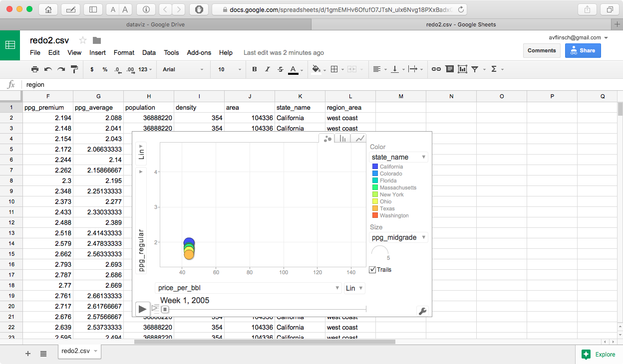
This version reduces the number of entities down to the 9 states that are reported on by the US Energy Information Administration. I would have liked to have been able to use data from all 50 states, but the data is only available in regional, selected state, and select cities.
The main thing that I did differently in this version was to have all 3 gas grades (regular, midgrade and premium) along with the average of the 3 values so that they can be plotted independently against the weekly average price for crude oil.
The color groupings were changed to the state names, and east coast/central/west coast. I also kept the the same sizing variables as the first revision - state population, population density and state land area.
Due to the actual data values involved, the most visually significant size variations can be seen by selecting population density as the size variable in the motion chart. This is probably not an important variable for actual data analysis, but it is the one that varies most dramatically between the selected states.
First Info Visualization Project - Revision Comments
All of the data came from the following sources -
fuel and oil prices US Energy Information Administration
population data US Census and Zip Code data
It would have been preferable to have had data for gasoline prices for all 50 states, Washington DC, Puerto Rico, and other territories, but unfortunately this combination was not available from the EIA. This information is probably available from other independent sources.
First Info Visualization Project - Final Revision
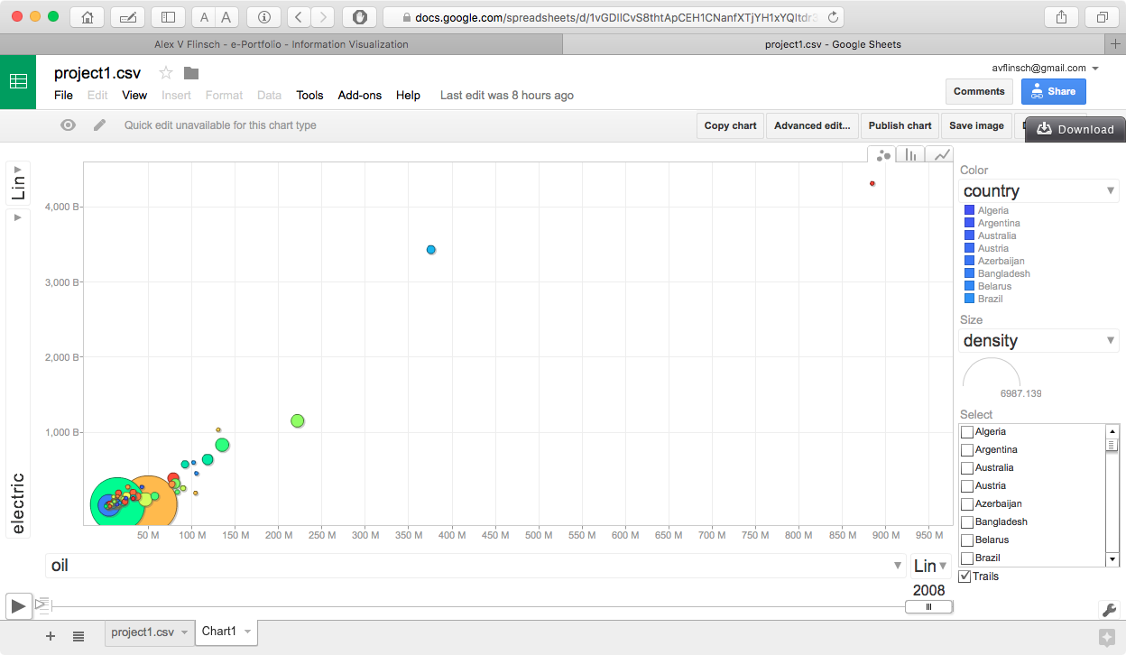
In this final revision, I used an entirely different set of data. While the original dataset is interesting, it does not show enough movement between the different entities in the chart. This is because one of the variables (crude price) was fixed across the data range for any given week. Since the actual project needed to show motion between the different entities, I gathered a different set of data from gapminder.org. This new data is now showing the relationship between electricity production and oil consumption in different countries arranged by economic regions. I also included a different set of size variables which are mostly related to the economic status of the country, along with a few which are relative to the population of the individual countries.
Data Selection
The countries and date range chosen for this visualization were simply based on what the most common for the two primary variables (electric production and oil consumption), the other indicators were chosen based on what seemed to make the most sense with regards to the economic status of the countries that were chose, along with which had the most data available.
Like the previous visualizations, the data was collected in the form of Excel spreadsheets, converted to CSV and loaded into a set of myssql tables. I then needed to create a pivot table by rearranging all of the fields into a different order from the original format, which had a country column, and individual columns for each year, into a format which had a country, year, and all of the data values for each row.
There two things that really stand out in this visualization. The first is the rapid growth of electric production, and oil or coal consumption in China, which can be observed by a quick ascent of the China bubble about midway thru the visualization. The second is a significant reduction in both oil and coal consumption in the United States, which can be seen by a backwards movement of the United States bubble in the final few years of the visualization.
Interesting things to try with this visualization.
- set the x axis value to coal instead of oil consumption.
- set either or both axes to a log scale, the range of values is more than one order of magnitude, and the perspective changes dramatically
- try various settings for the size component
- color component can be set to either country, or region
Lessons Learned
DATA DATA DATA. This seems to be one of the most important things to consider for a visualization of this type.
Second Info Visualization Project
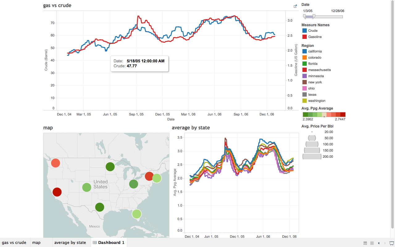
For this visualization I used the data that I originally collected for the motion chart project. The data that I gathered from the EIA was more suited for a set of line graphs and a map that it was for a scatter plot. As mentioned above, the data sows the relationships between crude oil prices and gasoline in the United States.
The date slider on the top graph ios being used as a filter for all three graphs on the dashboard. When it is adjusted the the map will show the average price for all grades of gas in each of the monitored states over the entire date range, and the individual dates for the state by state graph in the lower right corner.
Selecting a state (or multiple states with a control-click or command click) in the map graph will set the filters in the state line graph. I needed to be careful to set the color range on the state map, since the range of individual values was small for ny given date range, I opted to change the color values from a continous range to a stepped range with 9 discrete vales (the number of states being monitored), and set the minimum and maximum values to what would be appropriate for the range of values. The size of the circles also corresponds to the average price of crude oil over the date range. This value does not vary between the indvidual states, all circle sizes will be the same for all states in any date range, but will change if the date range slider is adjusted.
On all of the graphs, hovering the mouse over a datapoint will bring up an additional panel showing the exact data values that were being used. in the case of both the map and state line graphs, the individual prices of various gasoline grades are displayed.
Details of the data selection can be found here, information about formatting the data can also be found here.
One additional thing that I noticed - whenever any filter is changed while Tableau is pointing to a live database, the entire set of queries required to extract the data is executed. Since I was using views created within MySQL, this resulted in long time delays when playing with the visualizations. Once the data was exported as a complete Tableau workbook the queries took a significantly shorter amount of time to complete.
Second Info Visualization Project - First Revision
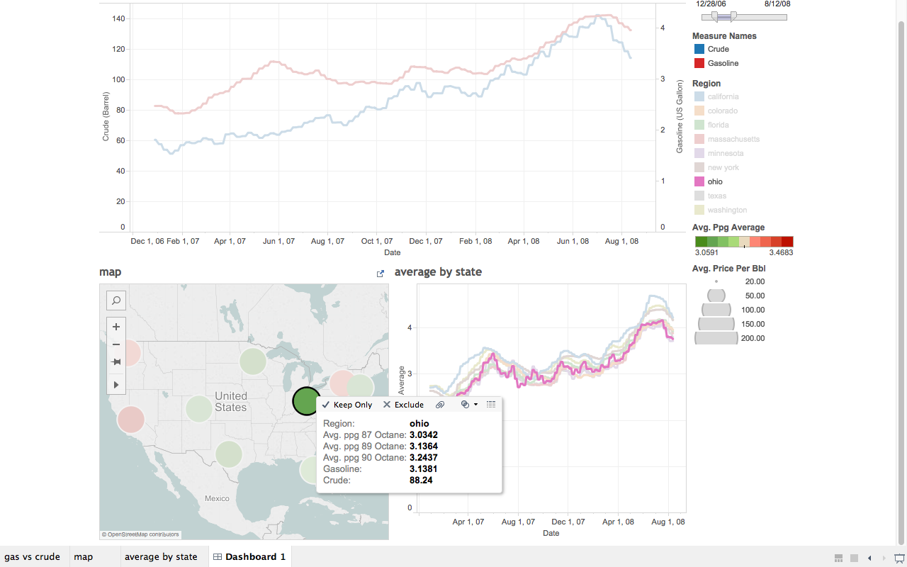
Suggestion 1 - change the action on the map to from a filter to enable highlighting the fields in the state by state graph.
This turned out to be fairly easy to do, and the resulting graph looks much better
Suggestion 2 - change sort order of data in the popups when hovering over the map. Ie was suggested to put it in numerical sequence, but there seems to be no option to do this in Tableau.
I thought it would be better to place them in a more logical sequence based on gasoline grade, so I tried reordering the data in the tooltips panel into ppg_regular, ppg_midgrade, ppg_premium, but that had no effect.
My next thought was that it was sorting based on the view of the data that I created in MySQL, so I changed the order of the columns, (originally ppg_premium, ppg_midgrade, ppg_regular) to ppg_regular, ppg_midgrade, ppg_premium so it would be more logical based on grade, but the data still sorted as ppg_midgrade, ppg_premium, ppg_regular.
A quick look at the Tableau knowledge base shows that changing the sort order is not possible - see - Tableau Knowledge Base
Realizing that the data was actually showing up in alphabetical order, based on the field name, I decided to rename the fields to to ppg_octane_87, ppg_octane_89, ppg_octane_90. While this may not always sort in the requested low-high sequence based on data values, it is a more logical one based on grade (which will usually work out to low to high). A look at the actual data values, shows that this is the case for the dataset that I have but this may not be true in the future.
Final Visualization Project
Description
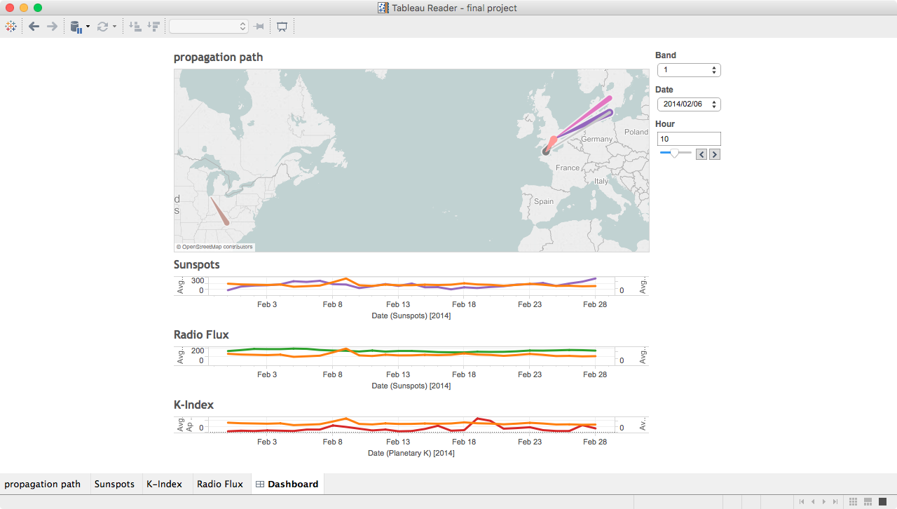
This project is an extension of a data analysis project that I started in my final year as an undergrad, which was an analysis of the impact of sunspots on High Frequency radio wave propagation. A brief overview ot the project can be found on my data analysis page.
Task #1 - large data files
The main source for data in this project was from WSPRnet. This is a site which accumulates reception reports of low power radio signals being transmitted by amateur radio operators around the world. While WSPRnet makes propagation path visualizations on their map page, the sheer volume of data makes it difficult for them to provide any mapping information more than 24 hours after a report has been uploaded to their site. This makes visualizing propagation over a long time period impossible. Fortunately, they do make the data available in monthly packages for download, for use by interested individuals.
The individual data files can be quite large, I used the February 2014 data for this example. The base file contains over 5,000,000 rows.
Task #2 - manipulating and translating data
Working with a dataset of this size presents several challenges. While the file is in a convenient CSV format, the large number of rows prevents it from easily being manipulated in Excel, or most other spreadsheet applications. In addition there is a key data field contained in the file which is needed for creating a path map, which is in a format that is not understood by Tableau.
In order to manipulate the data and convert the location data into standard longitud/latitude pairs, I created a table in MySQL that mirrored the CSV files that are available from WSPRnet. I also added additional fields to handle the converted data, and a few fields that are required to great path maps in Tableau.
  CREATE TABLE spots (
  spot_id int(11) NOT NULL AUTO_INCREMENT,
  timestamp datetime DEFAULT NULL,
  rx_station varchar(15) DEFAULT NULL,
  rx_grid varchar(6) DEFAULT NULL,
  snr int(11) DEFAULT NULL,
  frequency varchar(20) DEFAULT NULL,
  tx_station varchar(15) DEFAULT NULL,
  tx_grid varchar(6) DEFAULT NULL,
  tx_power decimal(10,5) DEFAULT NULL,
  drift int(11) DEFAULT NULL,
  distance int(11) DEFAULT NULL,
  azimuth int(11) DEFAULT NULL,
  band int(11) DEFAULT NULL,
  version varchar(25) DEFAULT NULL,
  code varchar(20) DEFAULT NULL,
  hour varchar(2) DEFAULT NULL,
  minute varchar(2) DEFAULT NULL,
  time varchar(5) DEFAULT NULL,
  date varchar(10) DEFAULT NULL,
  tx_longitude decimal(20,17) DEFAULT NULL,
  tx_latitude decimal(20,17) DEFAULT NULL,
  rx_longitude decimal(20,17) DEFAULT NULL,
  rx_latitude decimal(20,17) DEFAULT NULL,
  path_id varchar(10) DEFAULT NULL,
  PRIMARY KEY (spot_id),
  UNIQUE KEY spot_id_UNIQUE (spot_id),
  KEY band_idx (band),
  KEY timestamp_idx (timestamp),
  KEY date_idx (date),
  KEY tx_station_idx (tx_station),
  KEY rx_station_idx (rx_station),
  KEY tx_grid_idx (tx_grid),
  KEY rx_grid_idx (rx_grid)
);
And a simple loader script to insert the data into my new table:
-- load spots
truncate table spots;
load data  infile '/tmp/wspr_data.csv'
into table spots fields terminated by ','
optionally enclosed by '"'
	(@dummy,
	@unixtime,
	rx_station,
	rx_grid,
	snr,
	frequency,
	tx_station,
	tx_grid,
	tx_power,
	drift,
	distance,
	azimuth,
	band,
	version,
	code) set timestamp=from_unixtime(@unixtime),
	          time=date_format(timestamp,'%k:%i'),
	          hour=date_format(timestamp,'%k'),
	          minute=date_format(timestamp,'%i'),
              date=date_format(timestamp,'%Y/%m/%d');
Once that was done, I was left with the task of converting the Grid Squares used in the WSPRnet data into standard latidude/longitude pairs. I was unable to find a simple algorithm to convert the data, however I was able locate a Perl Module which could convert grid squares to/from latitude/longitudal pairs. While this seemed to be a convenient option, there was a minor problem I don't know Perl, I do however know enough other programming languages that I was able to cobble together a a short Perl program that generated a list of all possible 4 position grid squares with the corresponding latitude and longitude, so that I could create a translation tabel in MySQL.
#!/opt/local/bin/perl
use Ham::Locator;
my $locator = new Ham::Locator;
$f1="A";
$f2="A";
for ($a=0; $a<18; $a++) {
    for ($b=0; $b<18; $b++) {
        for ($c=0; $c<10; $c++) {
            for ($d=0; $d<10; $d++) {
                # get lat and long here
                $grid="$f1$f2$c$d";
  				$locator->set_loc($grid);
  				my ($latitude, $longitude) = $locator->loc2latlng;
                print ("$grid,$latitude,$longitude  \n");
            }
        }
        $f2++;
	}
    $f1++;
    $f2="A";
}
Once the table was loaded into MySQL, I added the following code to the loader script.
-- update tx/rx lat/lon
update spots s set
 s.tx_longitude = (select m.longitude from maidenhead m
 	where m.grid_square = left(s.tx_grid,4)),
 s.tx_latitude = (select m.latitude from maidenhead m
 	where m.grid_square = left(s.tx_grid,4)),
 s.rx_longitude = (select m.longitude from maidenhead m
 	where m.grid_square = left(s.rx_grid,4)),
 s.rx_latitude = (select m.latitude from maidenhead m
	where m.grid_square = left(s.rx_grid,4));

-- create path_id
update spots s set s.path_id = concat(concat(left(s.tx_grid,4),'-'),left(s.rx_grid,4))

Now that I have all of the data in a usable format, I can procede with creating the visualization that I wanted to work with.
Task #3 - additional data manipulation
Well, not quite all of the data is available yet. In order to create a pathline between two map points, Tableau needs to see some sort of field in the data that represents the sequence in which one would traverse the path. A path needs to consist of at least one starting point and an ending point, but there can be multiple intermediate points. For this example I only need a start and an end point.
The data for each path is now in a single row in MySQL, I now need to split this into multiple rows so that a path can be represented. To do this I ended up creating a specialized view of the data specifically for use in Tableau. I split each row into two parts, one having the originating longitude/latitude pair with a path order of 0, and a second row with the termination longitude/latitude pair with a path order of 1. Creating this view also effectively doubles the number of rows in the data.
	SELECT
        spot_id AS spot_id,
        tx_station AS tx_station,
        rx_station AS rx_station,
        band AS band,
        hour AS hour,
        date AS date,
        tx_longitude AS longitude,
        tx_latitude AS latitude,
        path_id AS path_id,
        0 AS path_order,
        distance as distance,
		tx_power as power,
        snr as snr
    FROM
        spots
    UNION ALL
    SELECT
        spot_id AS spot_id,
        tx_station AS tx_station,
        rx_station AS rx_station,
        band AS band,
        hour AS hour,
        date AS date,
        rx_longitude AS longitude,
        rx_latitude AS latitude,
        path_id AS path_id,
        1 AS path_order,
        distance as distance,
		tx_power as power,
        snr as snr
    FROM
        spots
    ORDER BY spot_id , path_order;
Views in MySQL are virtual, meaning that the query that creates the view is executed before any query that is based on the view. This greatly increases the amount of time needed to query the data. Other database systems such as Oracle, or DB2, allow for materialized views, that can be refreshed at timed intervals or when data is loaded into the base tables.

Task #4 - creating a path map
Compared to setting up the data, creating a path map in Tableau is fairly easy:
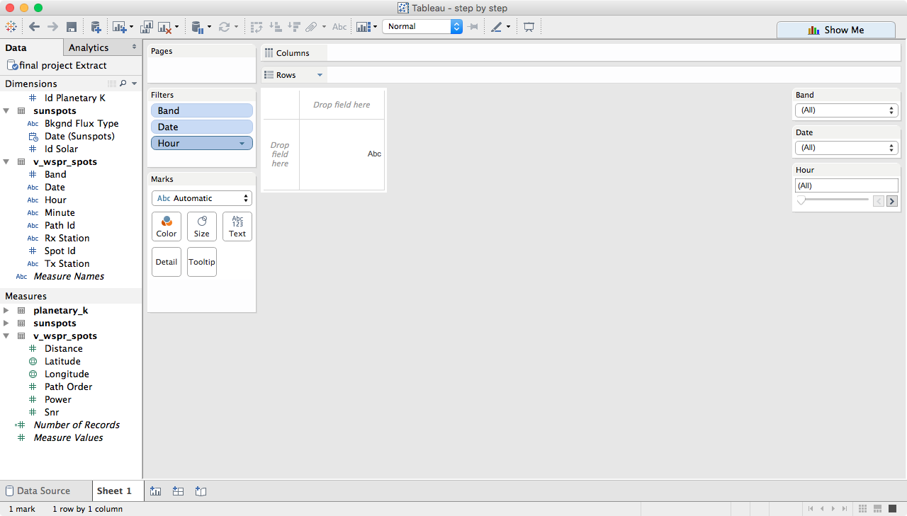
Create some filters. In my data 'band' is an integer, which Tableau wants to use as a measure, but I need it as a dimension, so change it, and then add filters for band, date and hour.
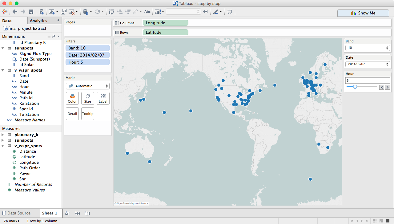
Drag longitude to columns, latitude to rows and change both to dimensions. I also set a few of the filters so that the map is not quite as confusing to look at.
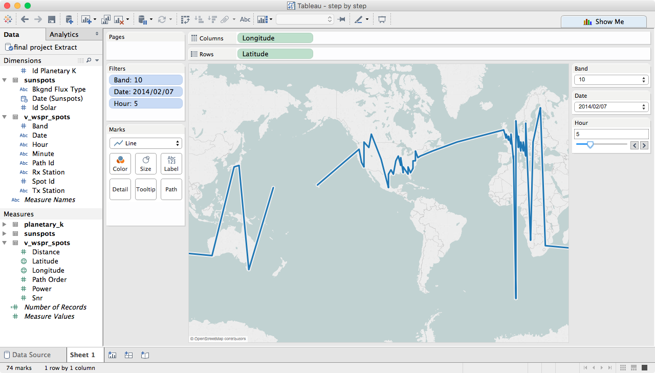
Change marks to line, notice that we now have a 'path' box in the marks card.
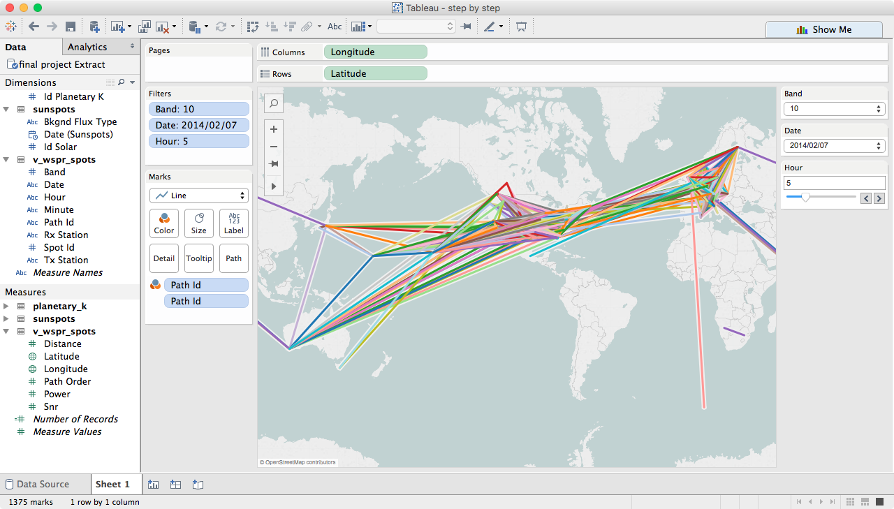
Move path_id to detail and color
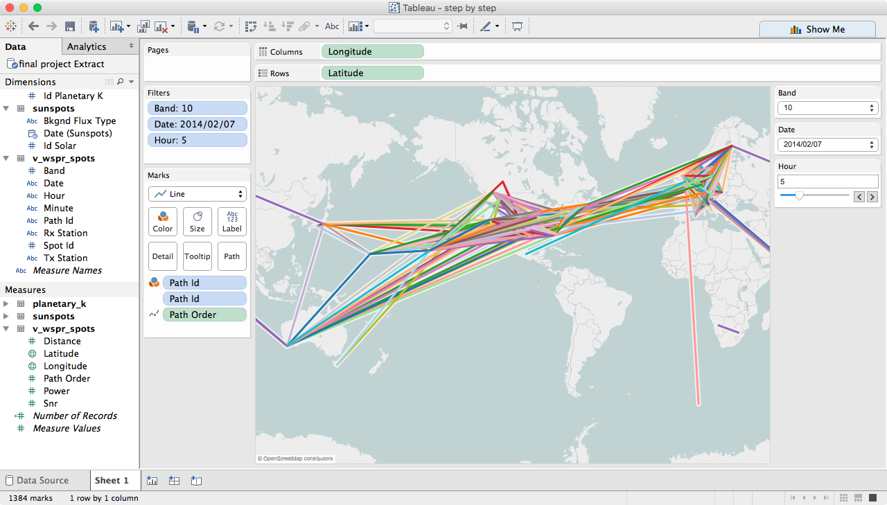
Move path_order to path, then change sum(path_order) to a dimension
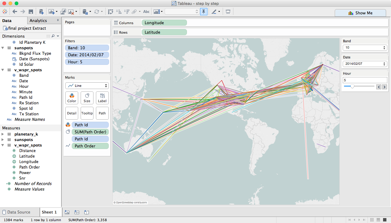
Move sum(path_order) to size
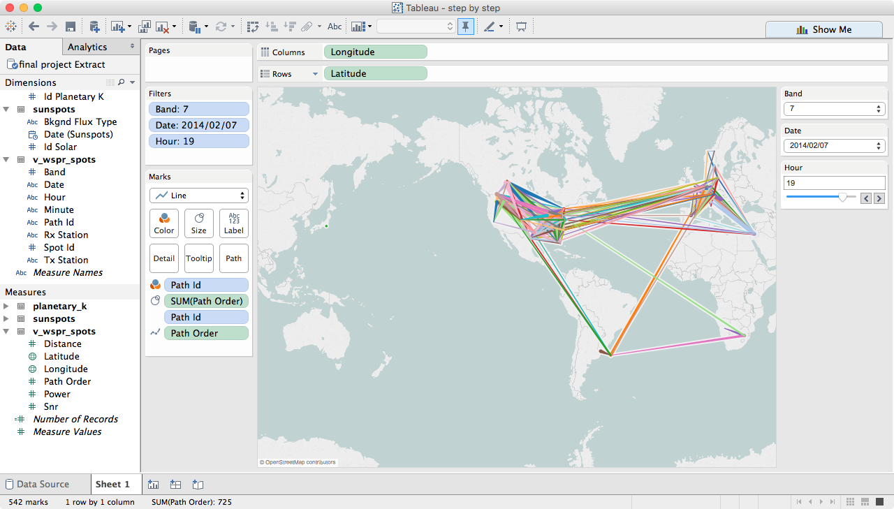
You can now play around with the filters and see what propagation paths were open at any given time....
